Apron in the color of the kitchen
What place in the house is most popular among households? Where do most family members spend most of their time: from the smallest to the largest? That's right, it's about the kitchen!
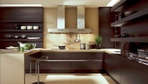
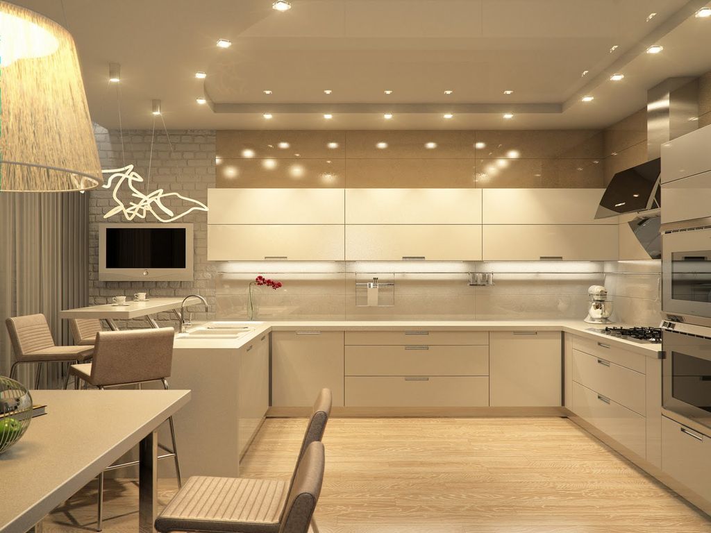
Modern kitchen long ago ceased to be the place where they only cook food. Today the kitchen is a cozy and comfortable corner with a pleasant and warm atmosphere. It is here that housewives try themselves in the preparation of various culinary masterpieces, spend long evenings over a cup of coffee and cheerful conversation with their best friend, gather with the whole family for a joint lunch or dinner, spend a lot of time with the kids, who are attracted to the kitchen with some kind of magic power.An ideal kitchen is at the same time a functional and practical room where a special and unusual atmosphere reigns.
Any kitchen should be practical and comfortable. Therefore, a lot of attention is paid to its arrangement and content. Household appliances are called assistants of modern housewives. It is various devices that greatly facilitate and accelerate the cooking process. But for practicality meets kitchen set. What is the furniture for the kitchen? These are drawers, shuhlyady, floor and wall cabinets, as well as the working surface. The kitchen set is visually composed of lower and upper parts, which are separated by an apron.
An apron is a wall panel that separates the worktop and the upper part of the furniture. The main function is to protect furniture and walls from splashes and other contaminants. However, today the protective function departs on a minor plan, more attention is paid to the exterior design, design and choice of colors. Is the color of the wall panel important? How to choose the appropriate color combination? What to look for? How to achieve harmony in the combination of kitchen, apron and decorative design of the room?
How to create a harmony of the facade and apron
The atmosphere in the house and in each individual room is created by harmoniously combining all the details. To achieve harmony in the interior is not so simple, but nothing is impossible. Designers recommend starting the kitchen with the selection of furniture sets.
Having decided on the type of furniture (style, colors, materials used, filling elements, components, etc.), you can proceed to the details of the design. Despite the fact that from an aesthetic point of view, the role of the kitchen apron is very important, do not forget about its primary purpose - a protective function. The question of the choice of materials used is top priority. The following criteria should be followed:
- hygroscopicity;
- resistance to temperature extremes;
- durability and reliability;
- high wear resistance;
- resistance to various kinds of pollution;
- resistance to aggressive chemicals used for cleaning;
- ease of care.
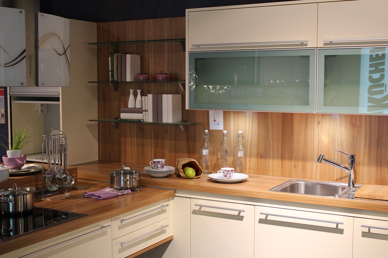
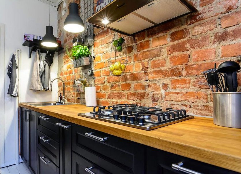
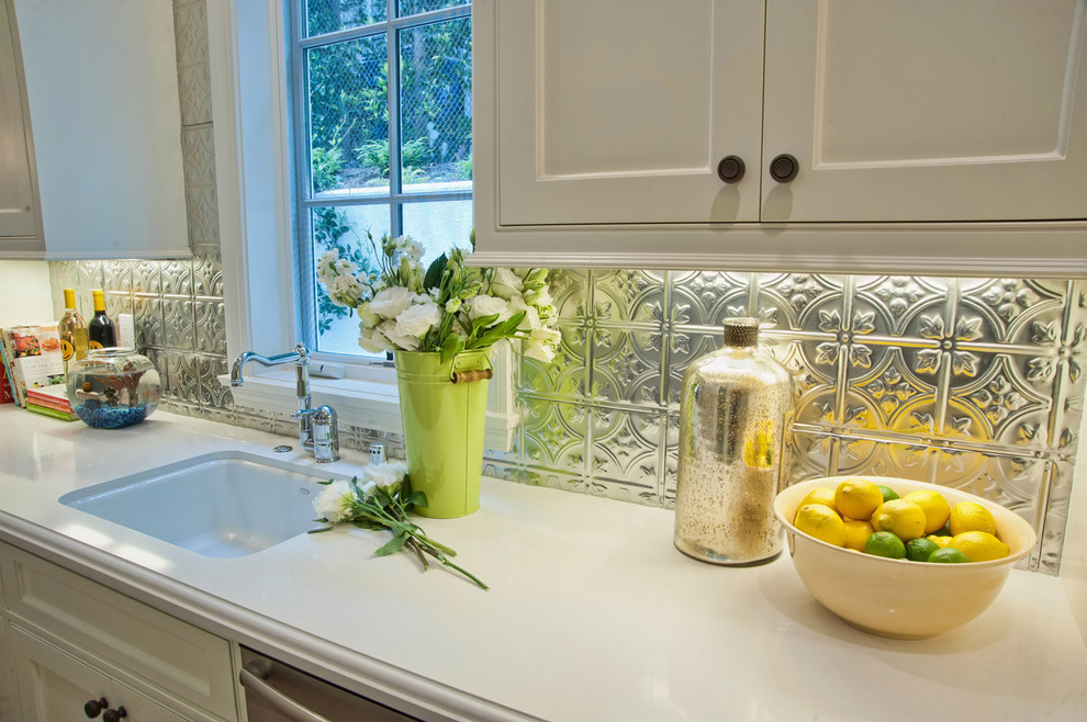
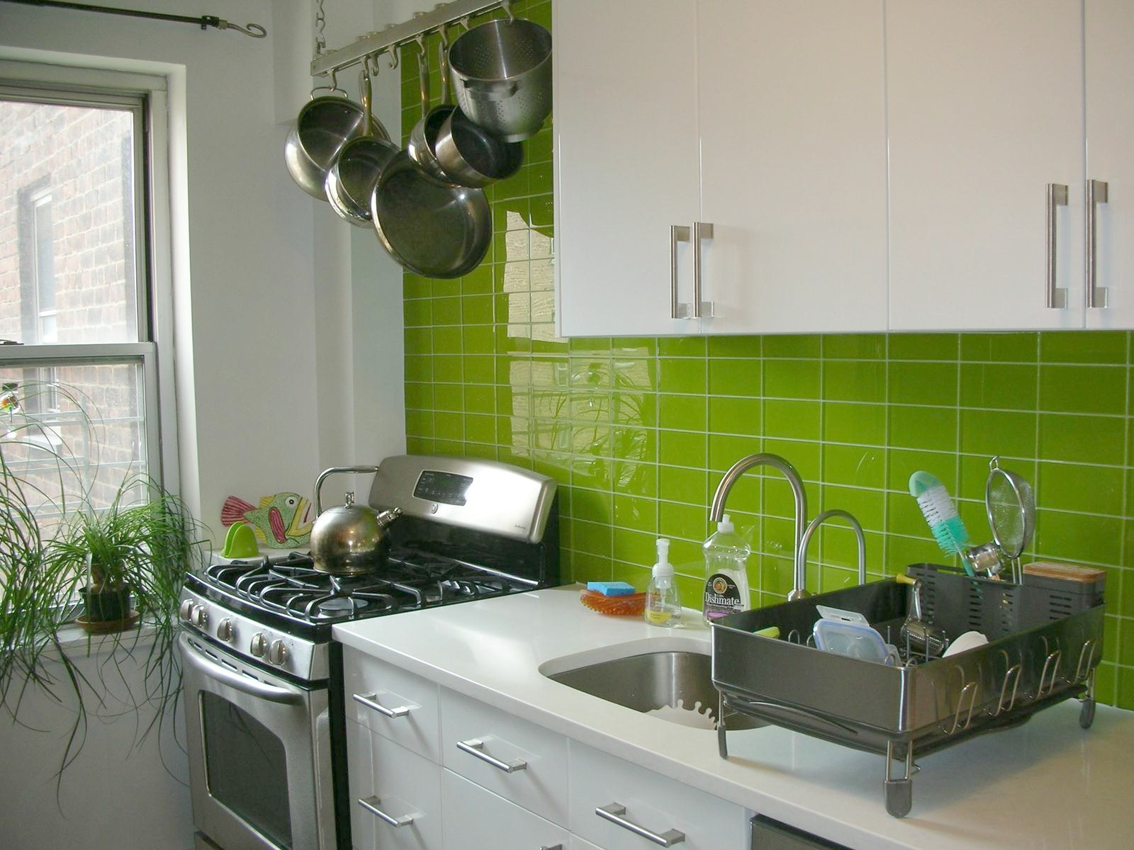
Therefore, the wall apron should be made of stainless steel, ceramic tile, solid wood, heat-resistant tempered glass,natural or artificial stone, wood plates coated with acrylic panels or laminated films, high-quality plastic.
The color of the kitchen apron plays an equally important role. If high-quality and practical materials are a guarantee of reliability and functionality, then the chosen color and type of design are responsible for the aesthetic appeal of the entire headset. Therefore, it is important to achieve harmony in the style design of the facades of furniture and wall panels.
Successful combinations
According to the comments of stylists, there are several options to help achieve this unity:
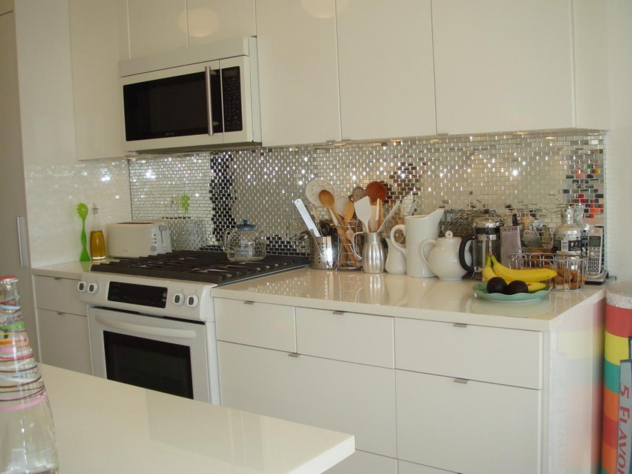
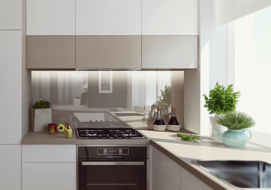
Neutral, universal or "invisible" apron
The peculiarity of such a panel in its inconspicuous. The most common options are: a method of applying monochrome in color or as close as possible shades, as well as transparent heat-resistant glass, which performs a protective function, but does not have any color.
Halftone game
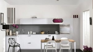
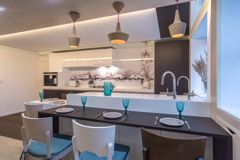
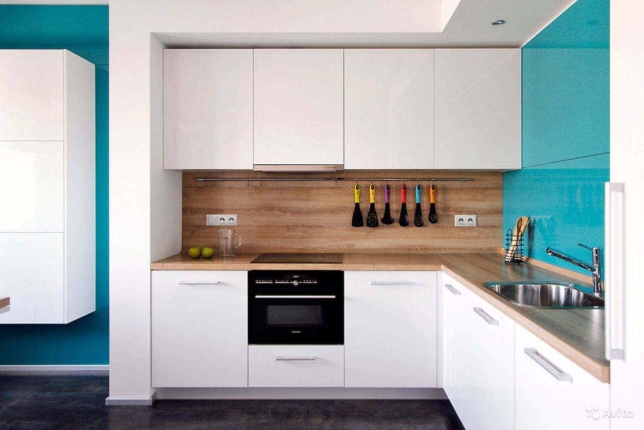
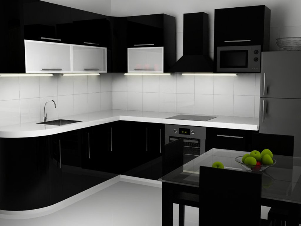
The gradient method is a win-win for any interior design. For example, for the kitchen, you can choose such combinations: the upper part is white, the wall panel is gray,and the lower cabinets and table top are several shades of black. Also, the combination of milk, coffee and brown colors will look stylish. If you want to make the kitchen brighter, then you should choose colorful colors and select the appropriate shades for them, a couple of shades lighter or darker.
Contrast combination
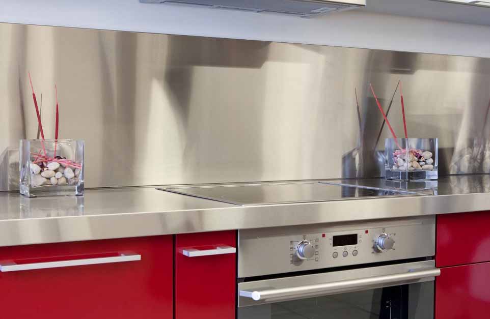
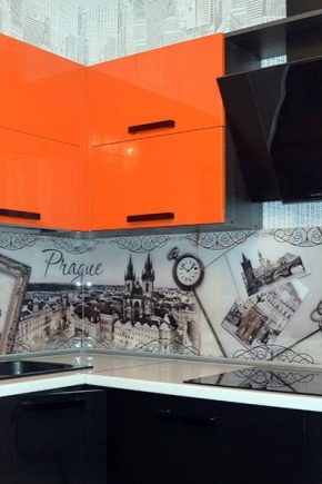
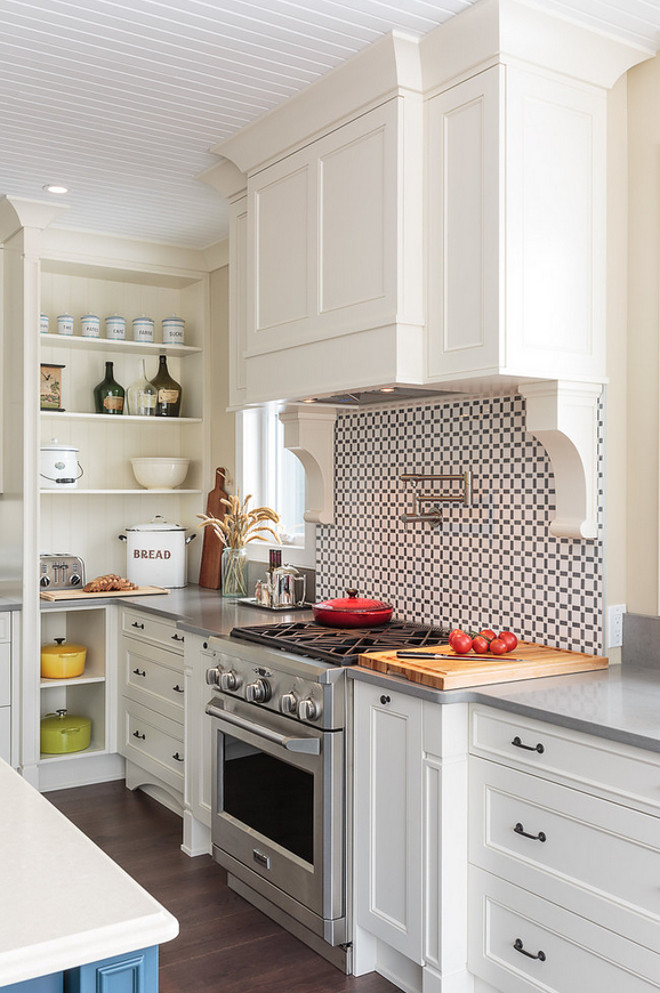
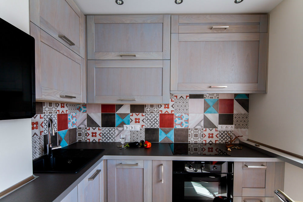
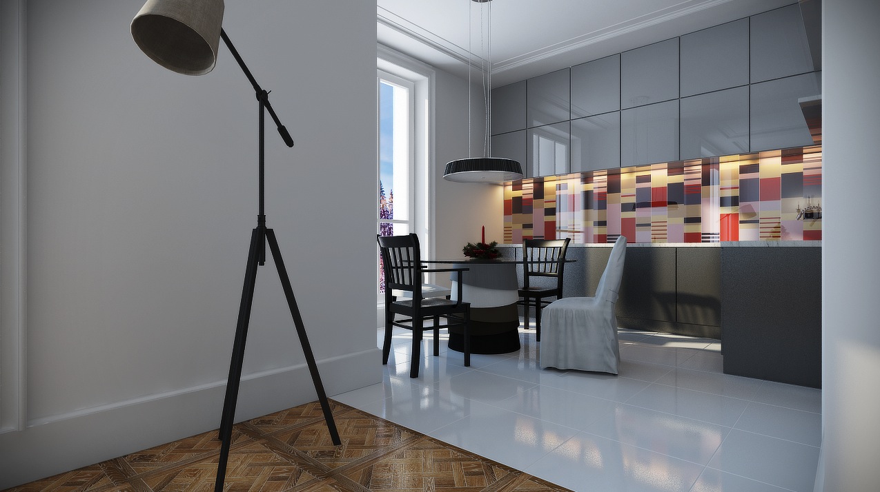
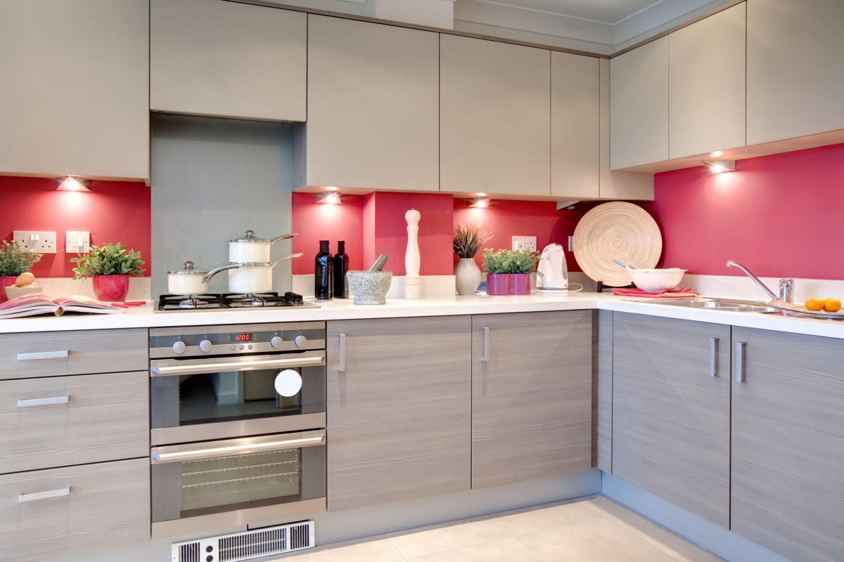
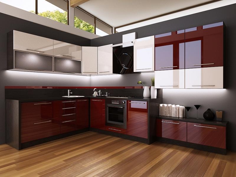
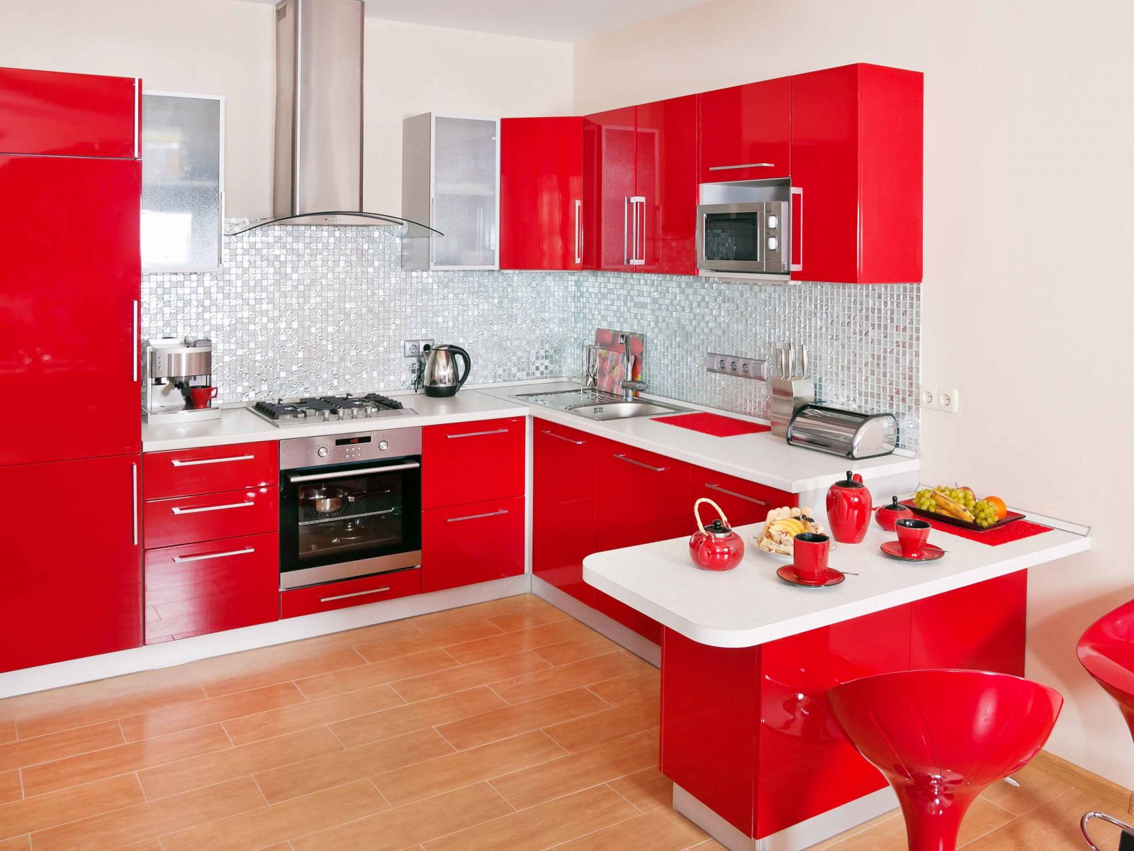
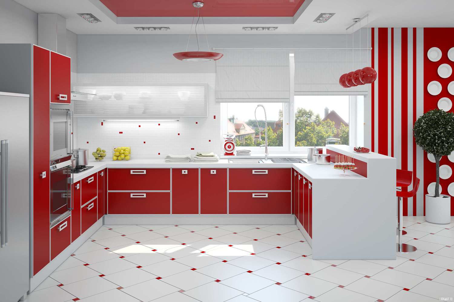
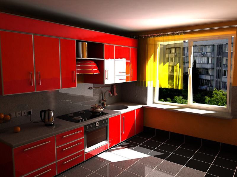
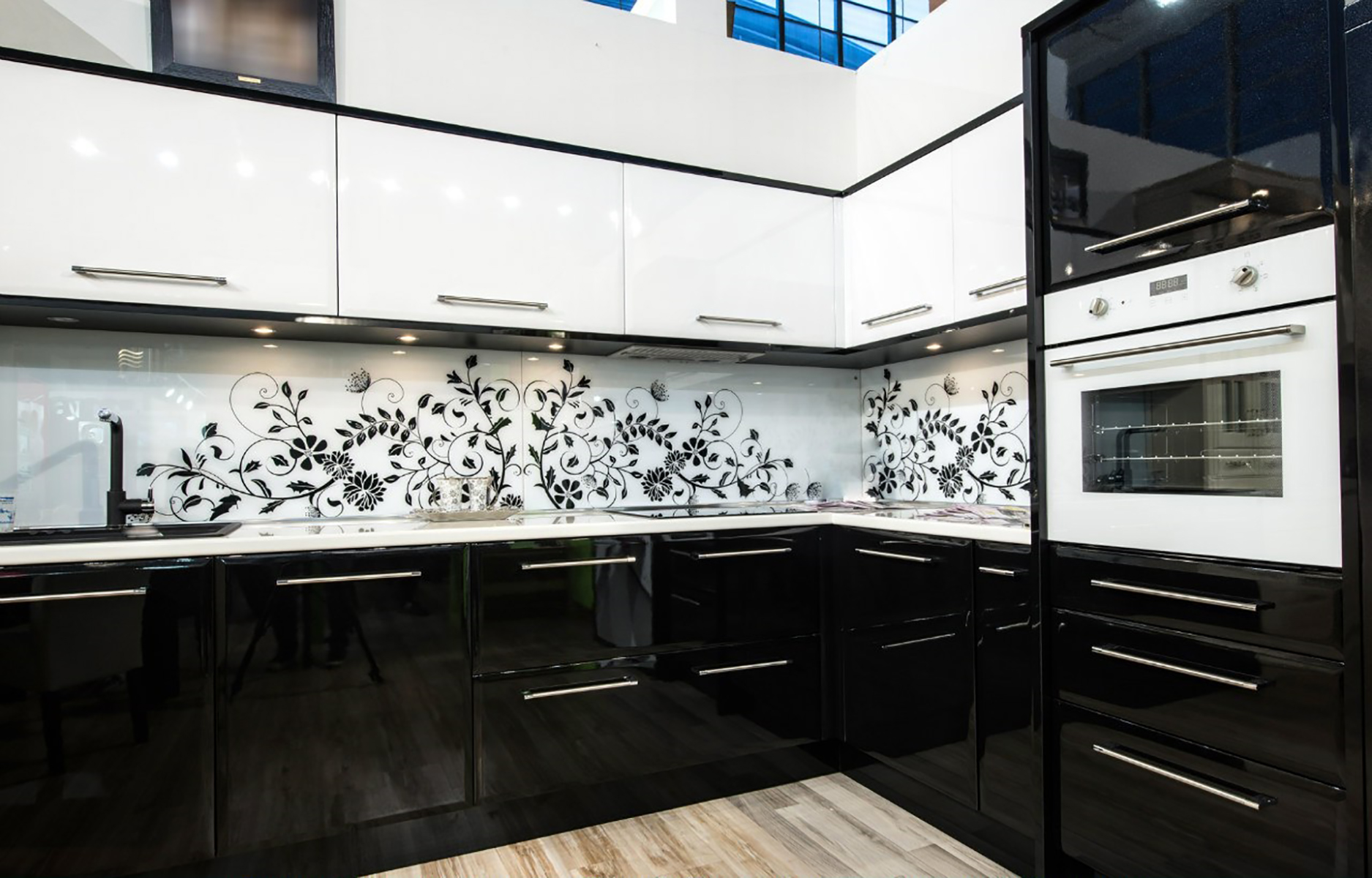
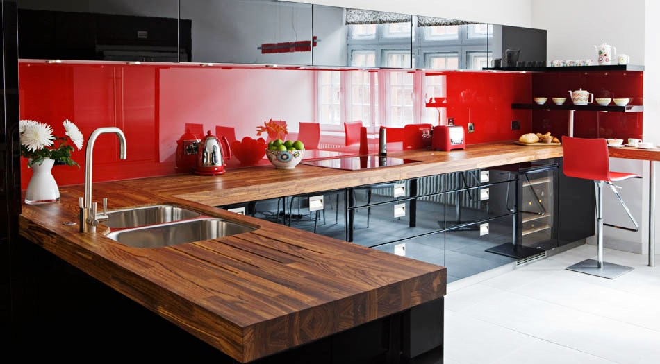
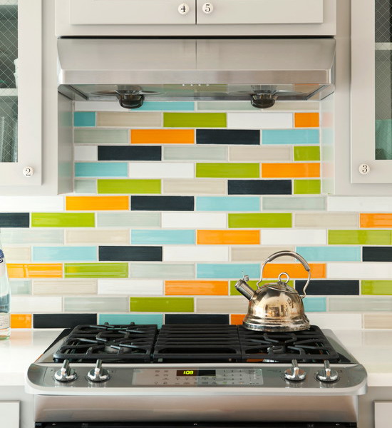
What can be advantageous to distinguish one object from another? Contrast. The application of the method of contrasting color combination is widely used in the manufacture of kitchen sets. Variations of white with black and red with black are very popular.
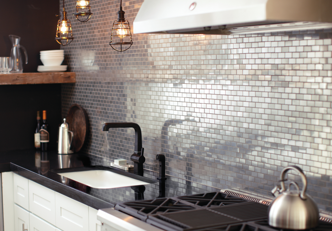
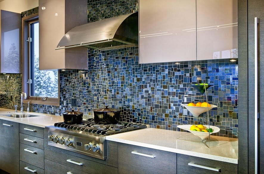
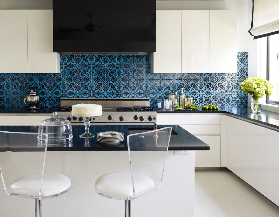
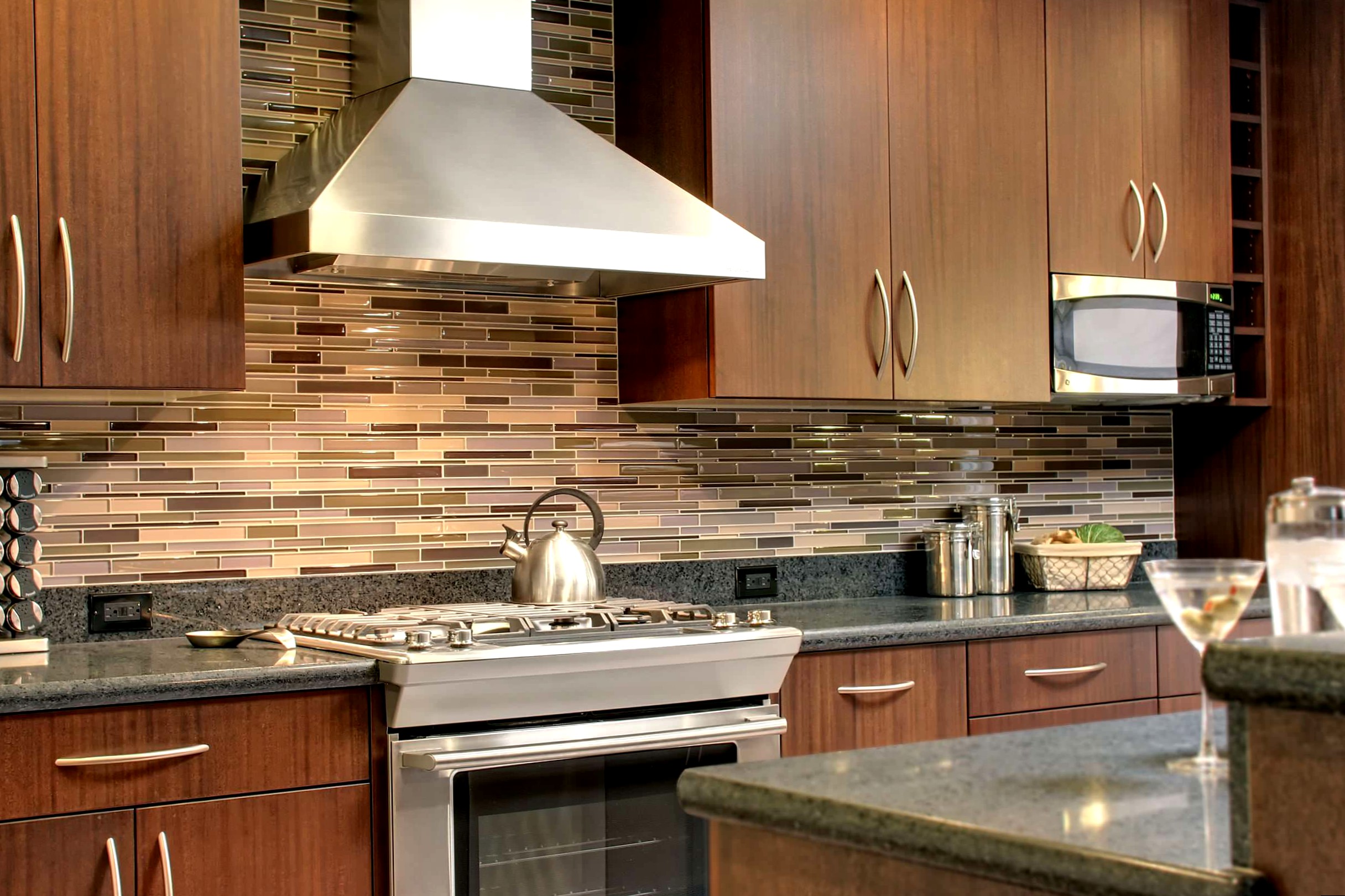
Textured apron
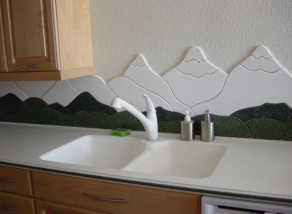
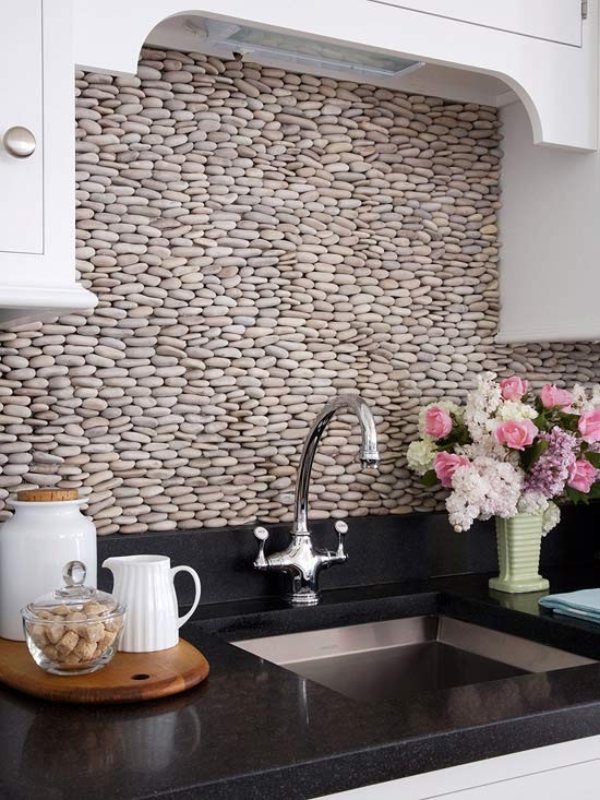
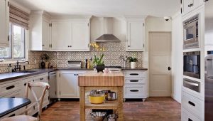
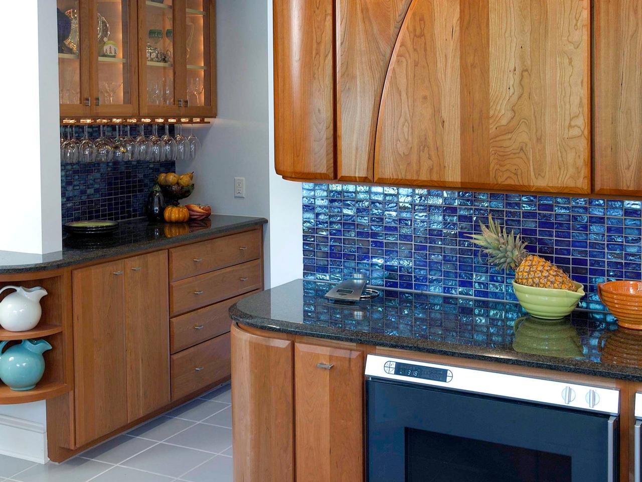
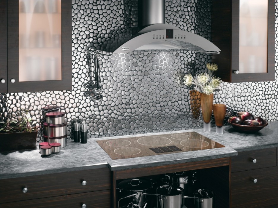
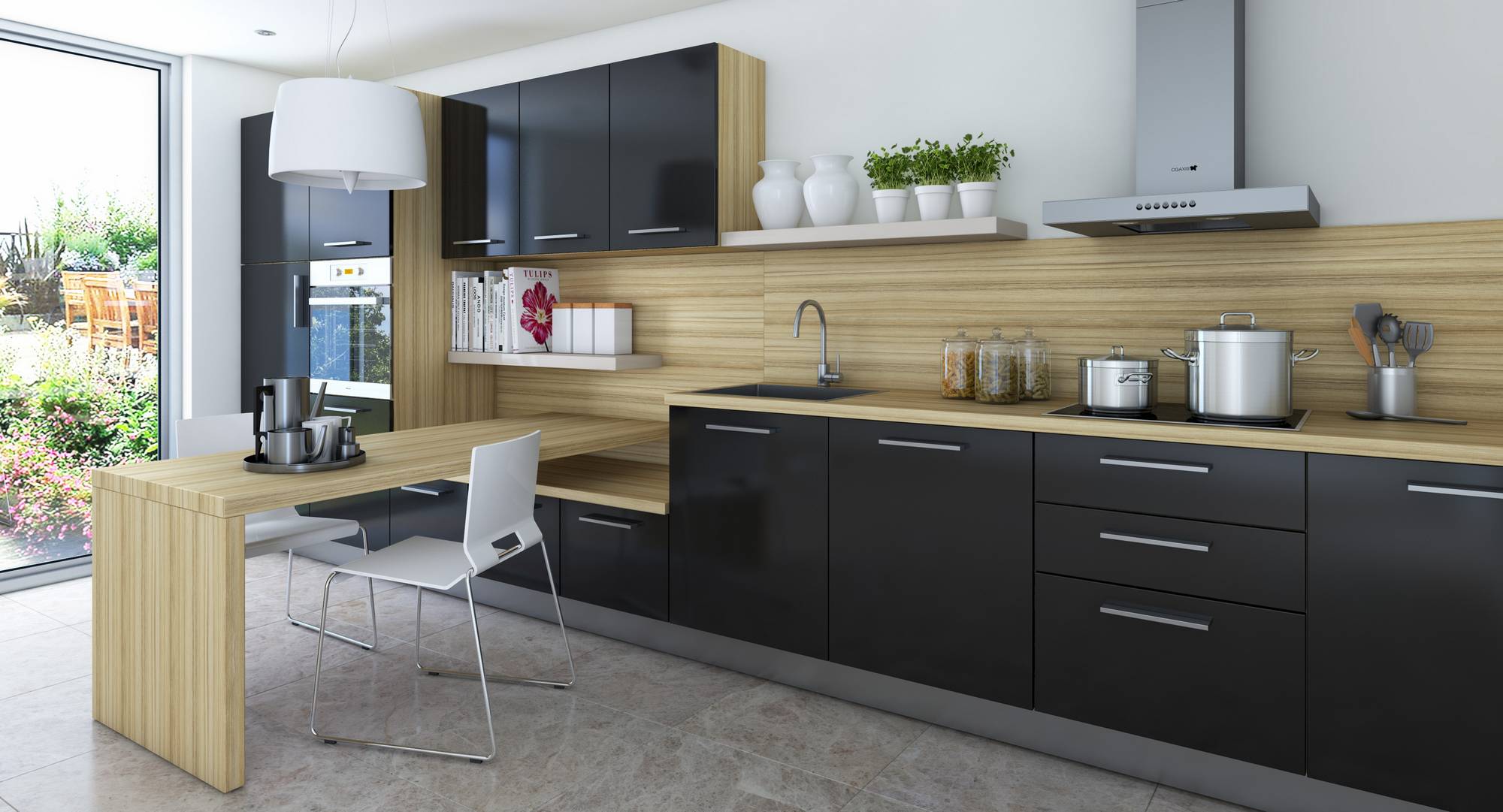
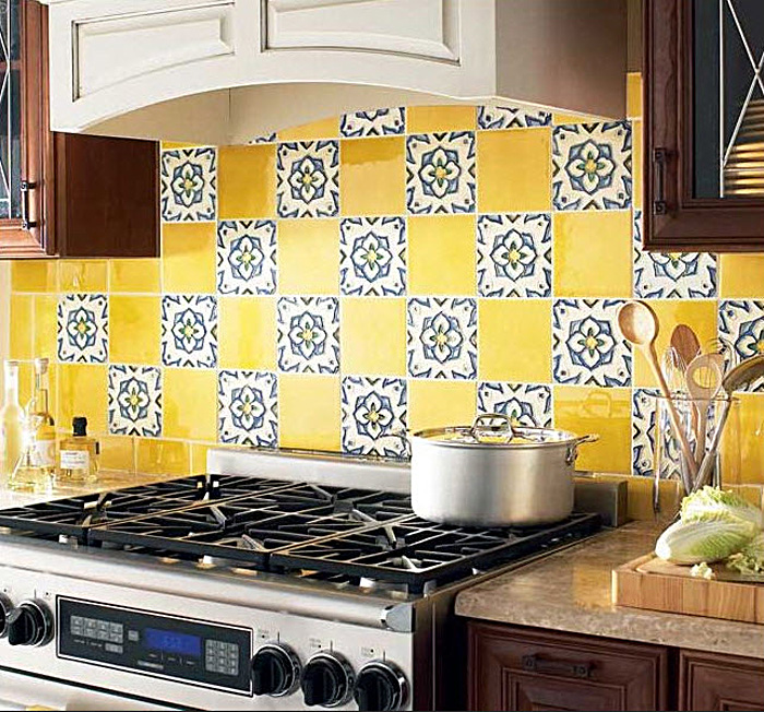
Naturalness and naturalness are the basis of this method. This apron attracts the attention of the original texture. This may be a panel of solid wood, the use of natural or artificial stones, tiles of unusual shape, etc.
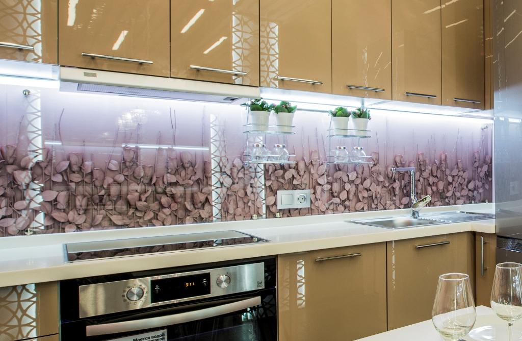
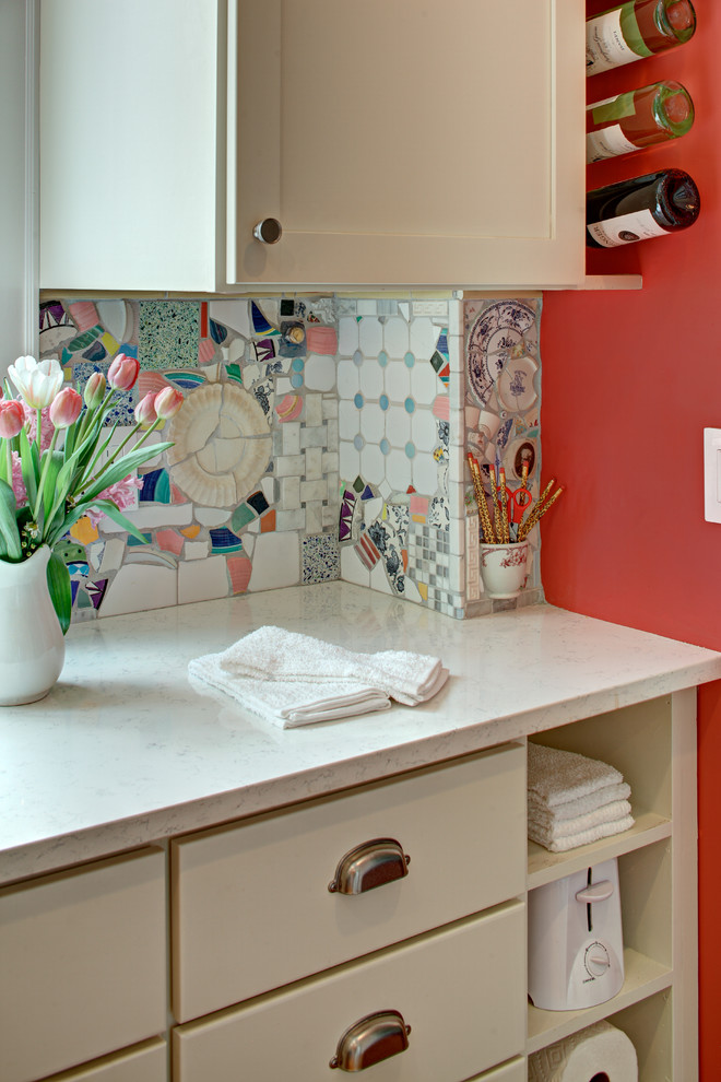
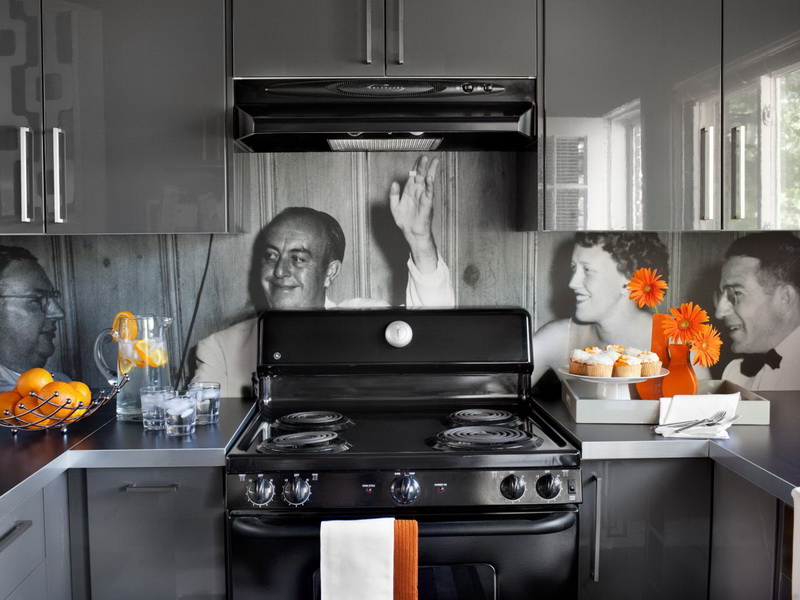
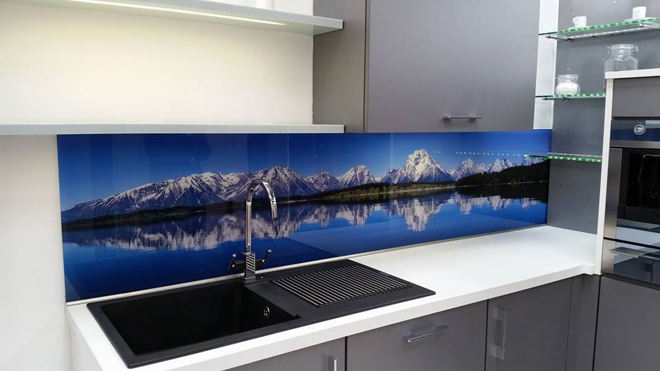
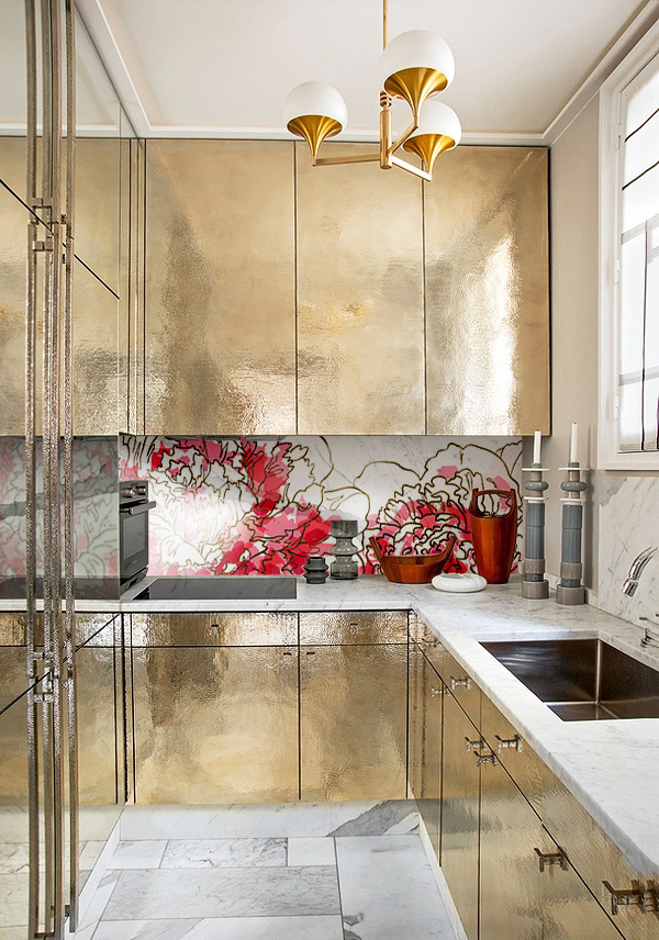
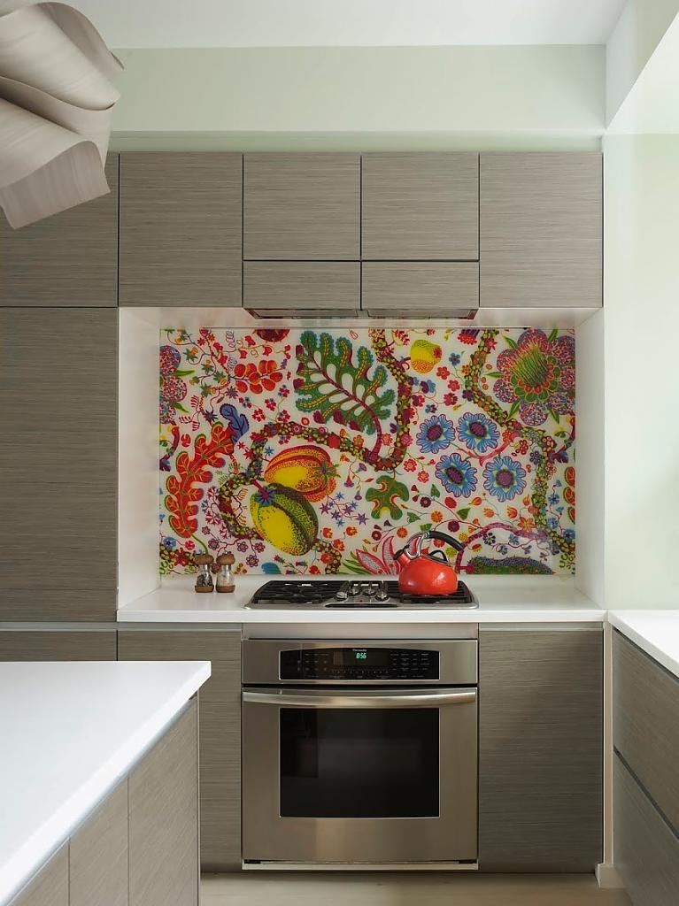
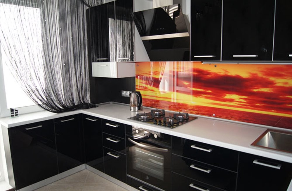
Brightness, juiciness and originality
Today, wall panels with a photo printing, 3D drawing, bright and juicy design are in high demand. In order for the kitchen not to look too motley and ridiculous, in contrast to the colorful and unusual apron, you must choose calm or neutral shades for the fronts of the kitchen set.

The aesthetic appeal of the kitchen depends on the harmony and unity of all its elements.Therefore, do not neglect the issue of choosing colors for a kitchen set.

We select a shade
The selection of colors for the wall panel directly depends on the color of the furniture. Therefore, designers of interior decoration recommend initially to determine the color options for the facades, and only then proceed to the apron.
Very often, the final choice depends on the taste, character and even temperament of the person himself. It is possible to trace such regularity that cheerful and restless people often prefer brightness and originality. While calm individuals are more prone to pastel or muted tones.

The choice of the main color is focused on the overall style, type of furniture, its content, compatibility with household appliances. But the wall panel in its colors is tied to the headset.
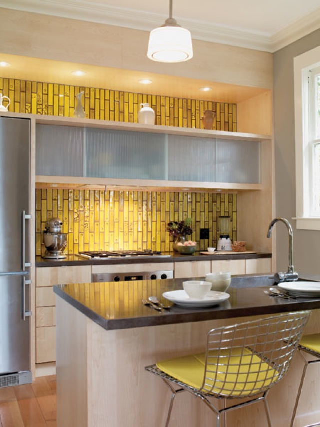
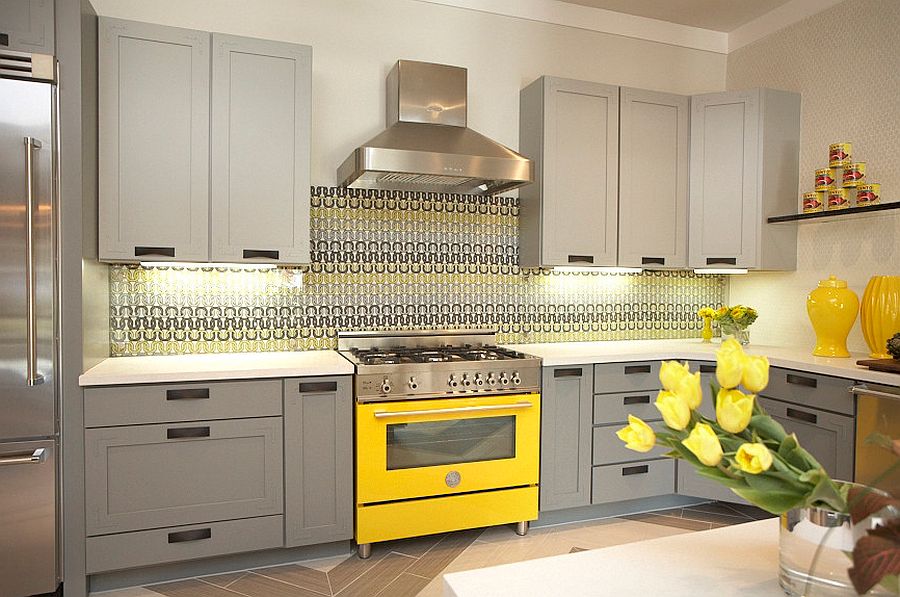
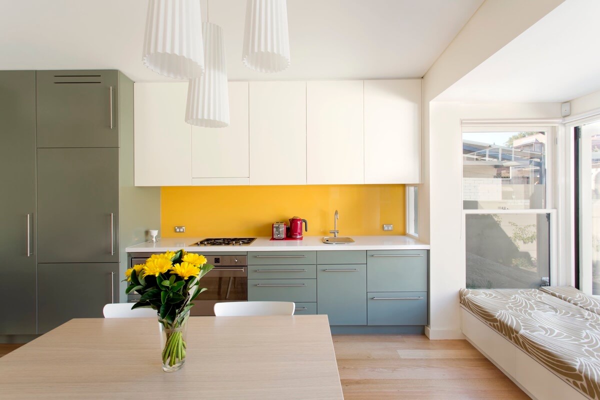
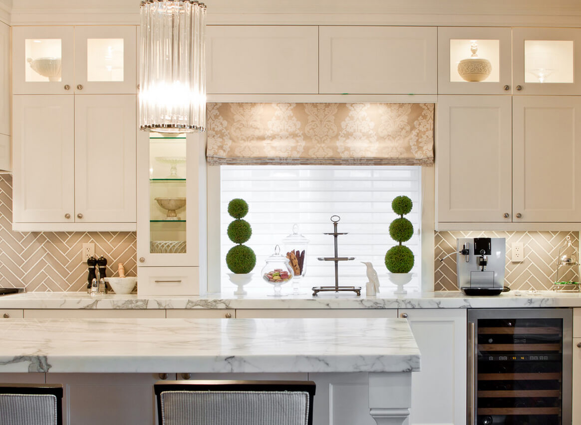
So, almost any color from the existing palette of colors in the world is suitable for a bright kitchen. White color is also unpretentious in the choice of combinations. Both calm pastel shades (sky blue, lilac, light blue, pale green) and bright flashy tones (red, orange, bright crimson, rich yellow) are suitable for white. White kitchen with a green apron looks beautiful.White color will emphasize tenderness, and green - will give the room a feeling of freshness.
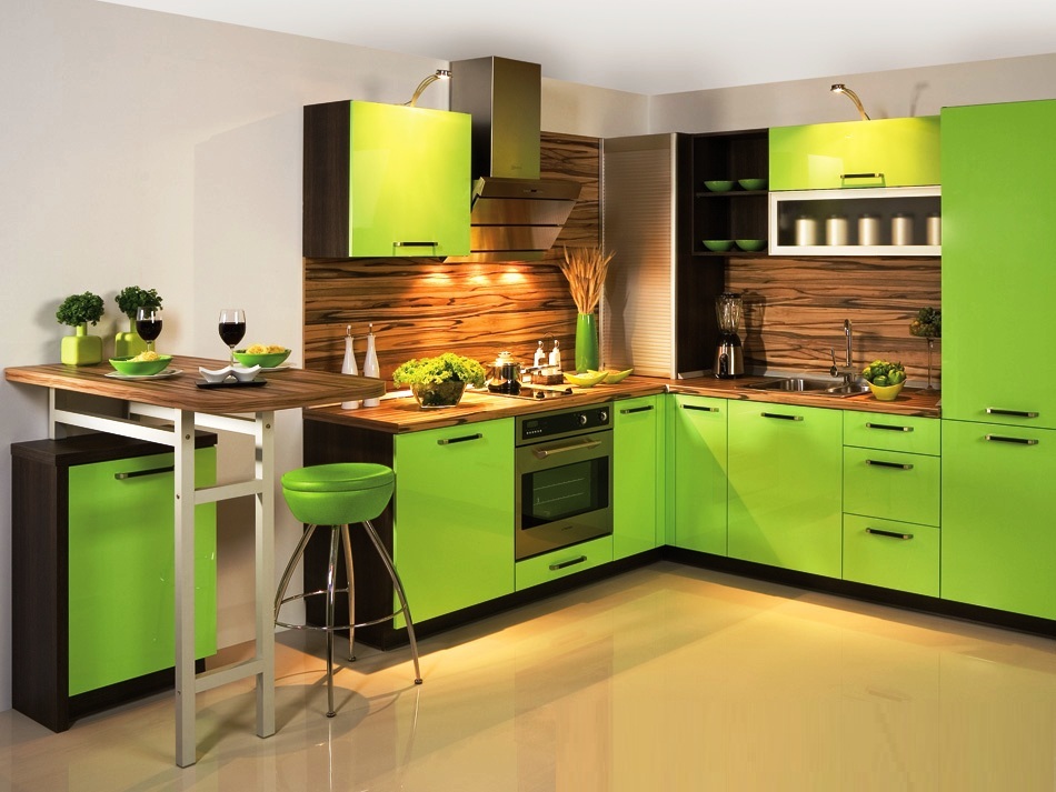
Kitchen in green tones is the personification of inner peace and unlimited energy. It will be interesting to look at the combination of different shades of green. If there is a desire to add brightness, then you can dilute this idyll with bright yellow or saturated purple.
For a beige kitchen, stylists recommend choosing shades of brown, orange or coffee.
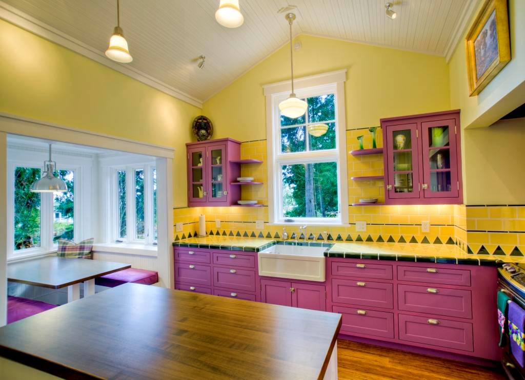
Orange, bright yellow, olive and green are suitable for the purple kitchen.
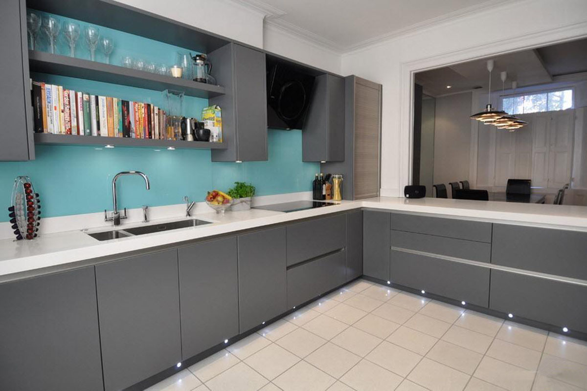
And gray will look beautiful with turquoise, blue, various shades of blue, as well as in combination with red, crimson and hot pink.

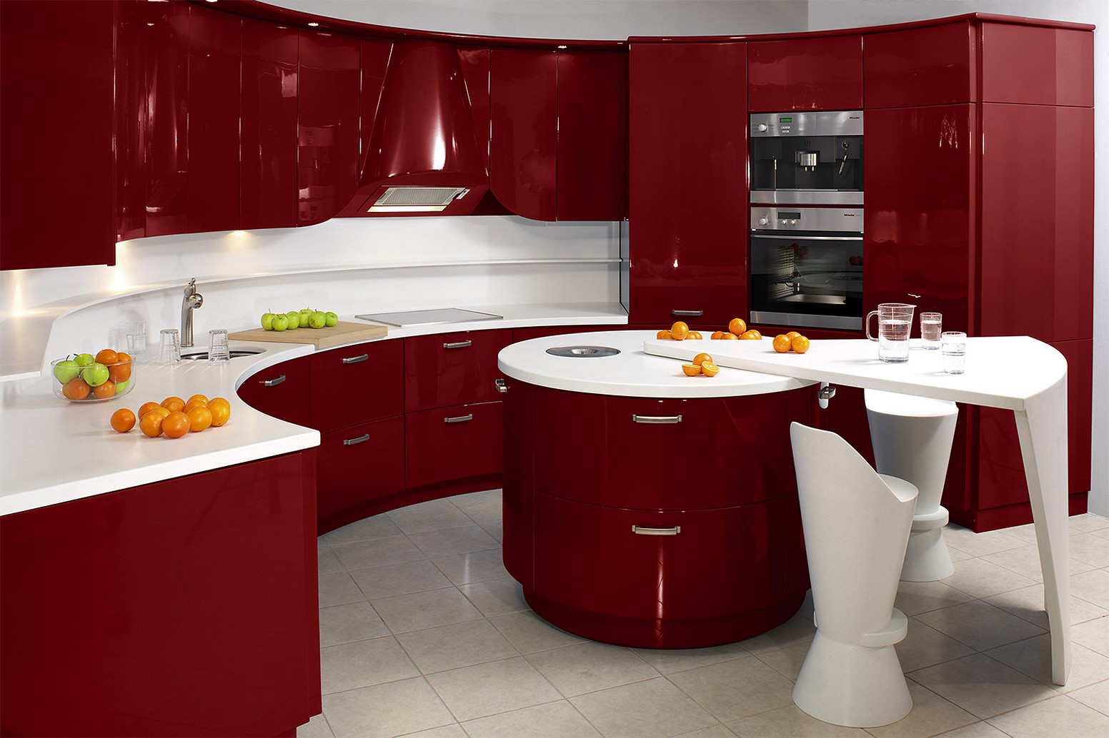
For burgundy kitchen suitable apron milk, white, light coffee or gray tones.
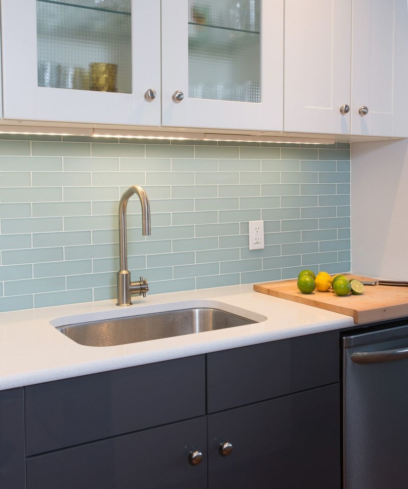
Furniture in blue or blue is better to complement the gray, milky, beige or even white wall apron.
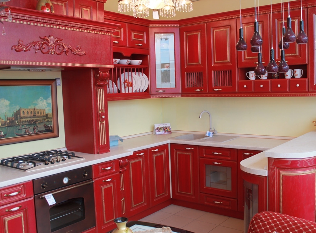
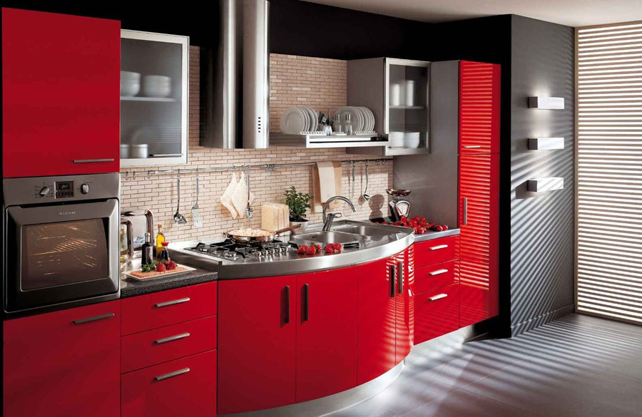
Red color provides an opportunity to put into practice all your imagination. After all, it harmoniously looks with white, black, orange, blue, aquamarine and other tones. The combination with pastel shades will make the room more calm and comfortable.But bright colors will add originality and vividness to such an interior.

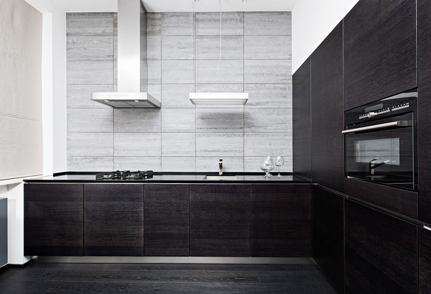
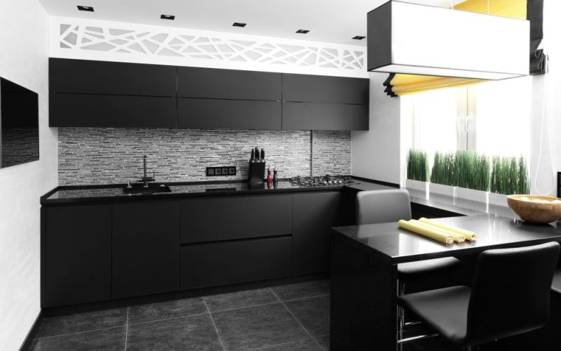
Kitchen set in black or wenge color should be diluted with light shades. Otherwise the room will be too dark and gloomy.
Combination Options
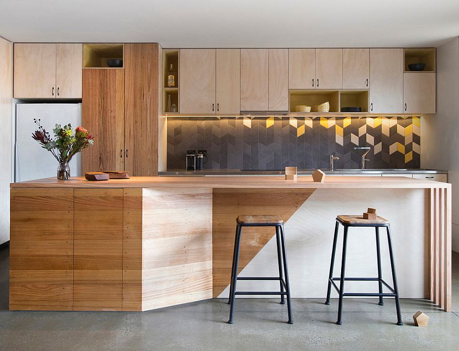
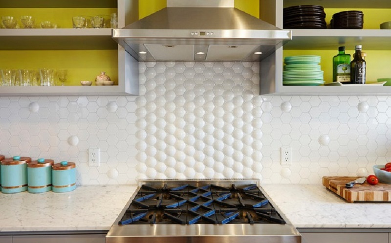
The monochrome and the use of the same color for the wall panel of the kitchen set cannot be called a rational solution. More interesting and winning options will be a combination of different shades or even colors, as well as the use of the texture method. For example, ceramic tiles of irregular shape will look original - triangular, hexagonal, in the form of rhombuses, etc. To make this type of design more visually attractive, you can fill the gap with colored grout or use decorative screws at the joints of the tiles.
A bright multi-colored apron is ideal for a quietly colored kitchen set. At the same time, color combinations can be both correct and completely unexpected. According to the color combination tables, you can choose different options. So, brown, beige, and milky are perfectly combined with orange.Violet will be interesting to look with bright yellow, green or calm lilac. Turquoise can be complemented with shades of yellow, blue, brown and terracotta. Today, the olive and orange duet are especially popular.

No less important will be the drawing on the wall panel itself. Having carefully studied the tastes and preferences of customers, the conclusion suggests itself that today high interest is given to drawings in the form of a combination of various geometric figures, ornaments in ethnic style, seascapes, still lifes from vegetables and fruits, and also images of flowers (lilac, orange lilies, tulips, sunflowers, poppies).
Wall apron - an important element of the kitchen. When designing it, it is important not to be afraid to turn all your ideas, wishes and fantasies into reality. The kitchen should be not only practical and functional, but also comfortable with a special warm atmosphere.